
The Brand Design
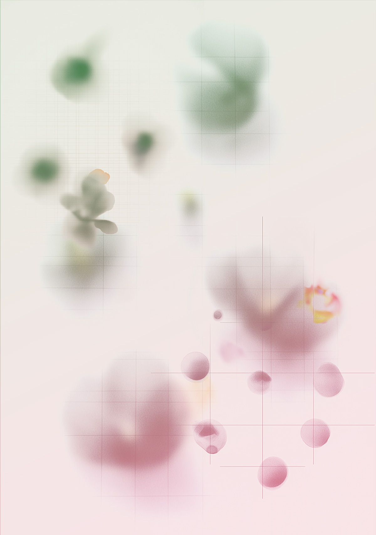
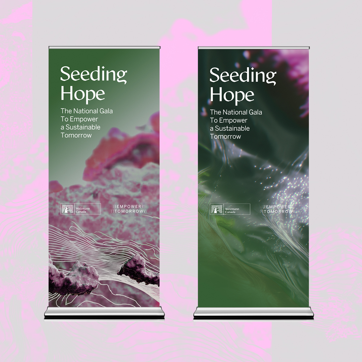
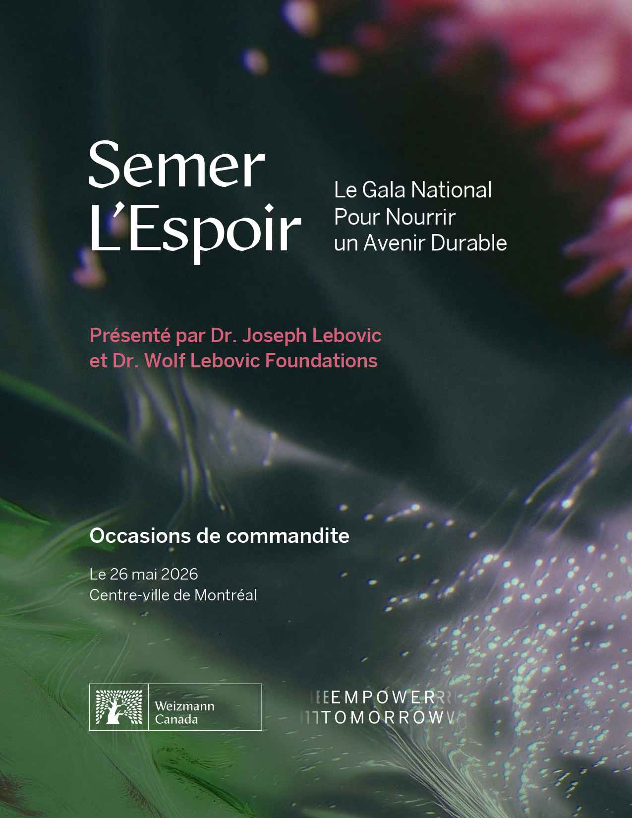
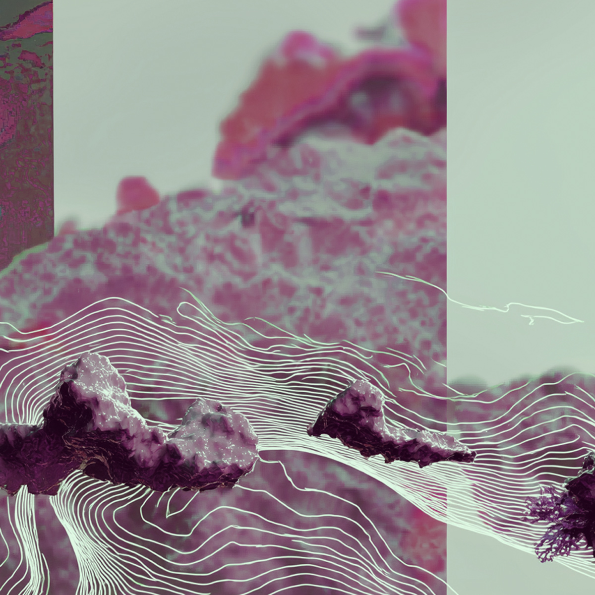
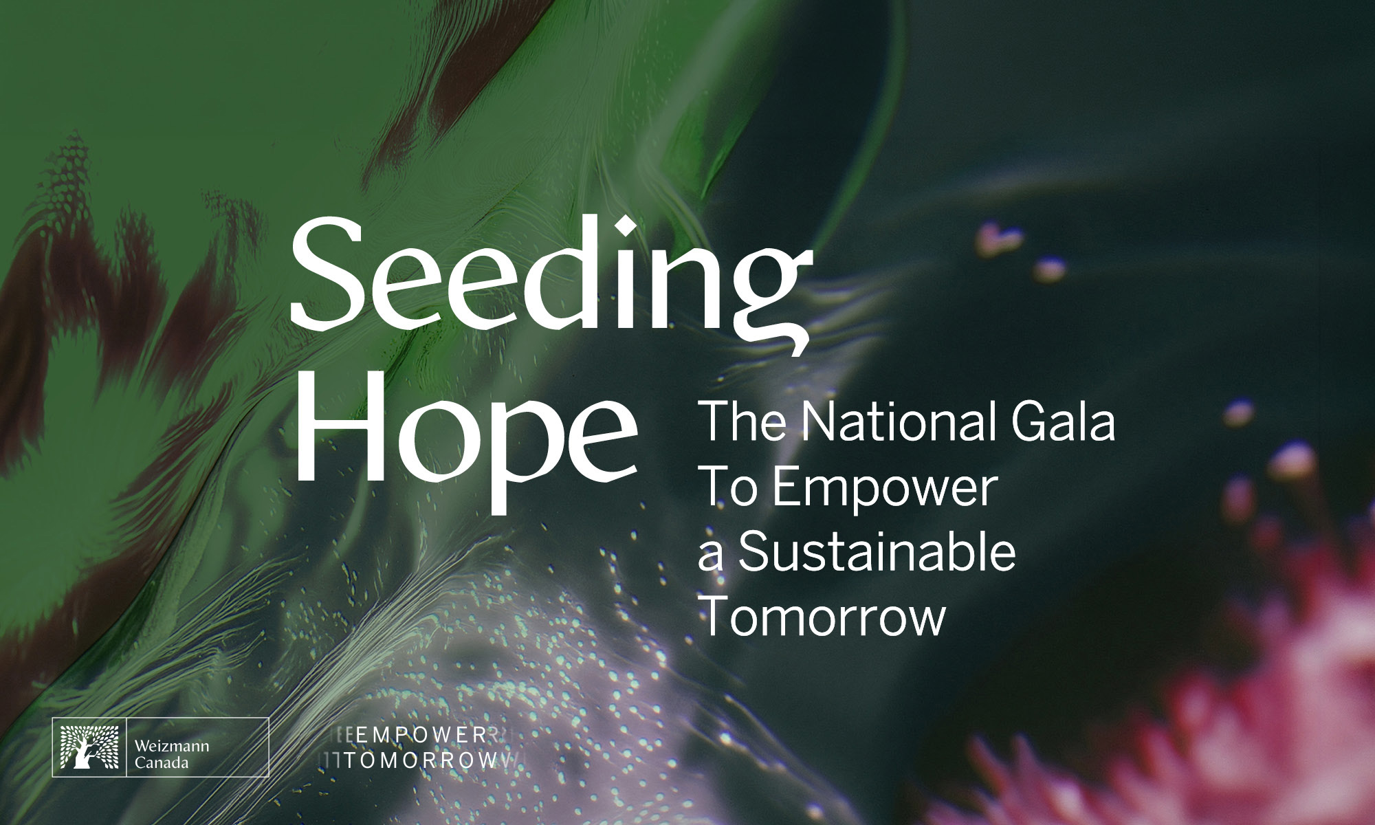
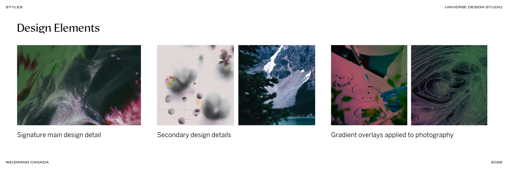
The branding was designed to reflect the gala’s themes of nature while feeling elegant, contemporary, and aligned with the organization’s established visual identity. We developed a series of one-of-a-kind abstract artworks featuring organic tones and contemporary floral details that paired seamlessly with typography and layered design elements. The result was a highly flexible visual system that could be applied consistently across a wide range of gala materials and environments.

Process: Defining the Branding Details
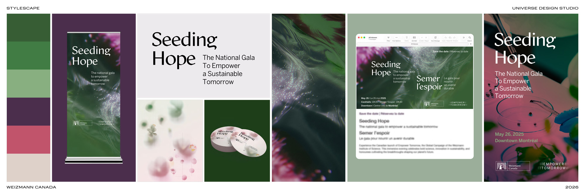
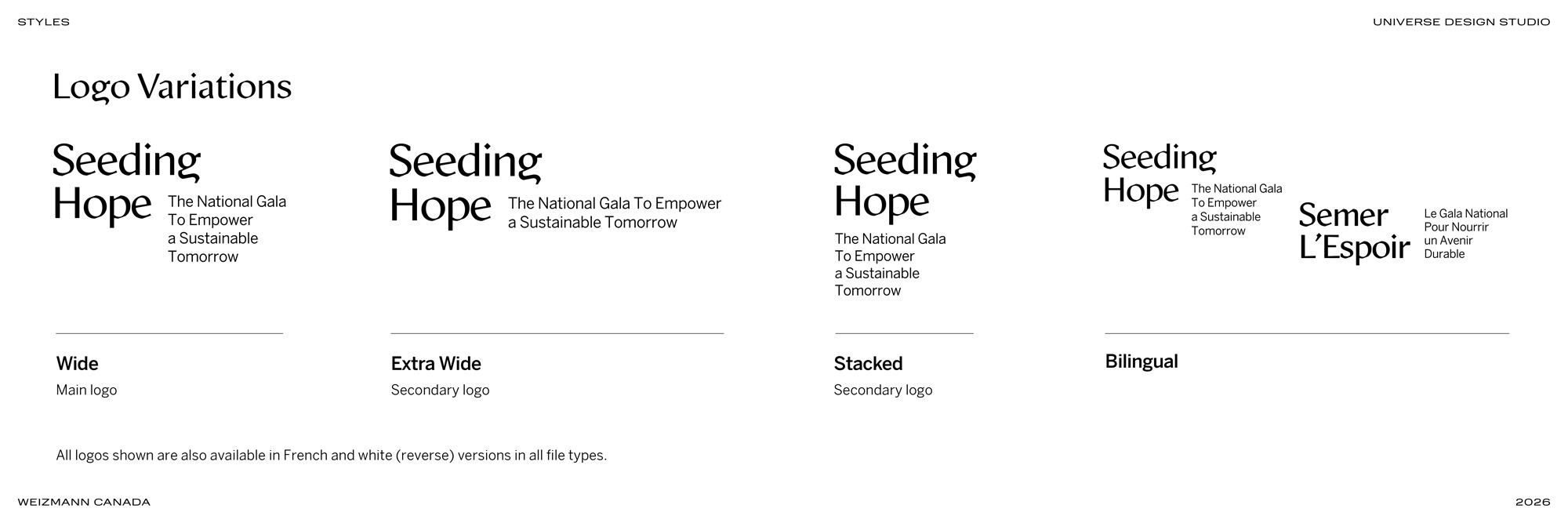
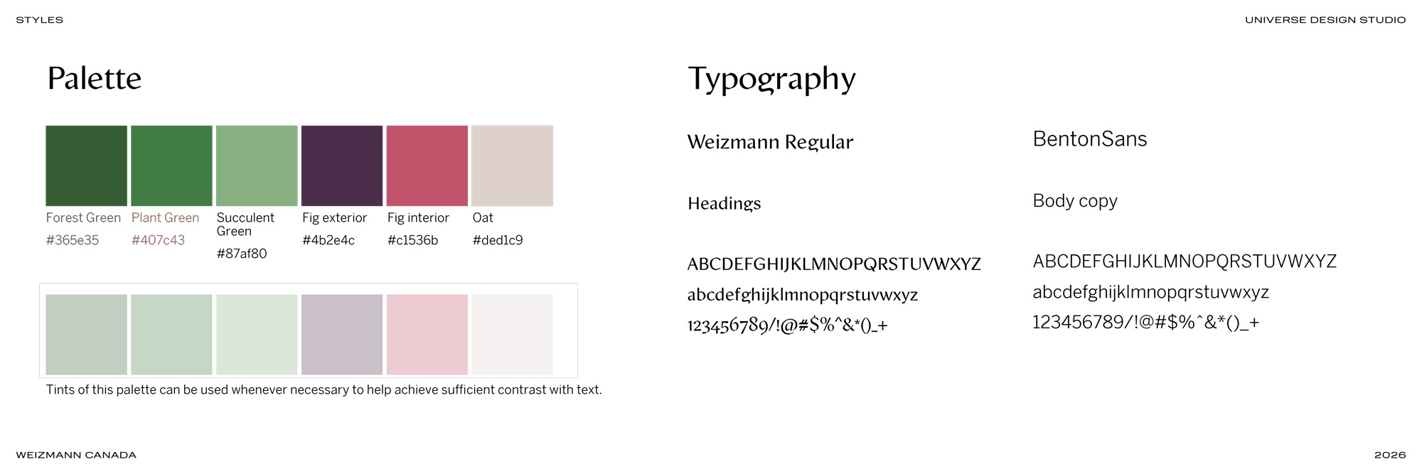
To define the identity, we first worked through a series of stylescapes exploring tone, typography, colour, and graphic direction. The final palette incorporated select colours from the core Weizmann Canada brand alongside new complementary tones developed specifically for the gala. Existing brand typography was also carried through to maintain cohesion and alignment with the parent identity. Below is the final approved stylescape, which was then developed into a (mini) style guide.
The Design Assets
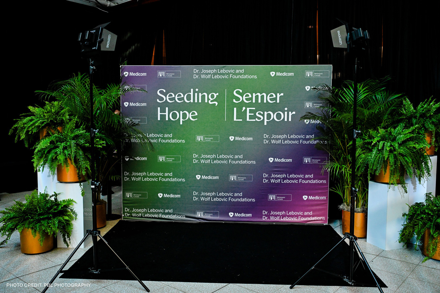
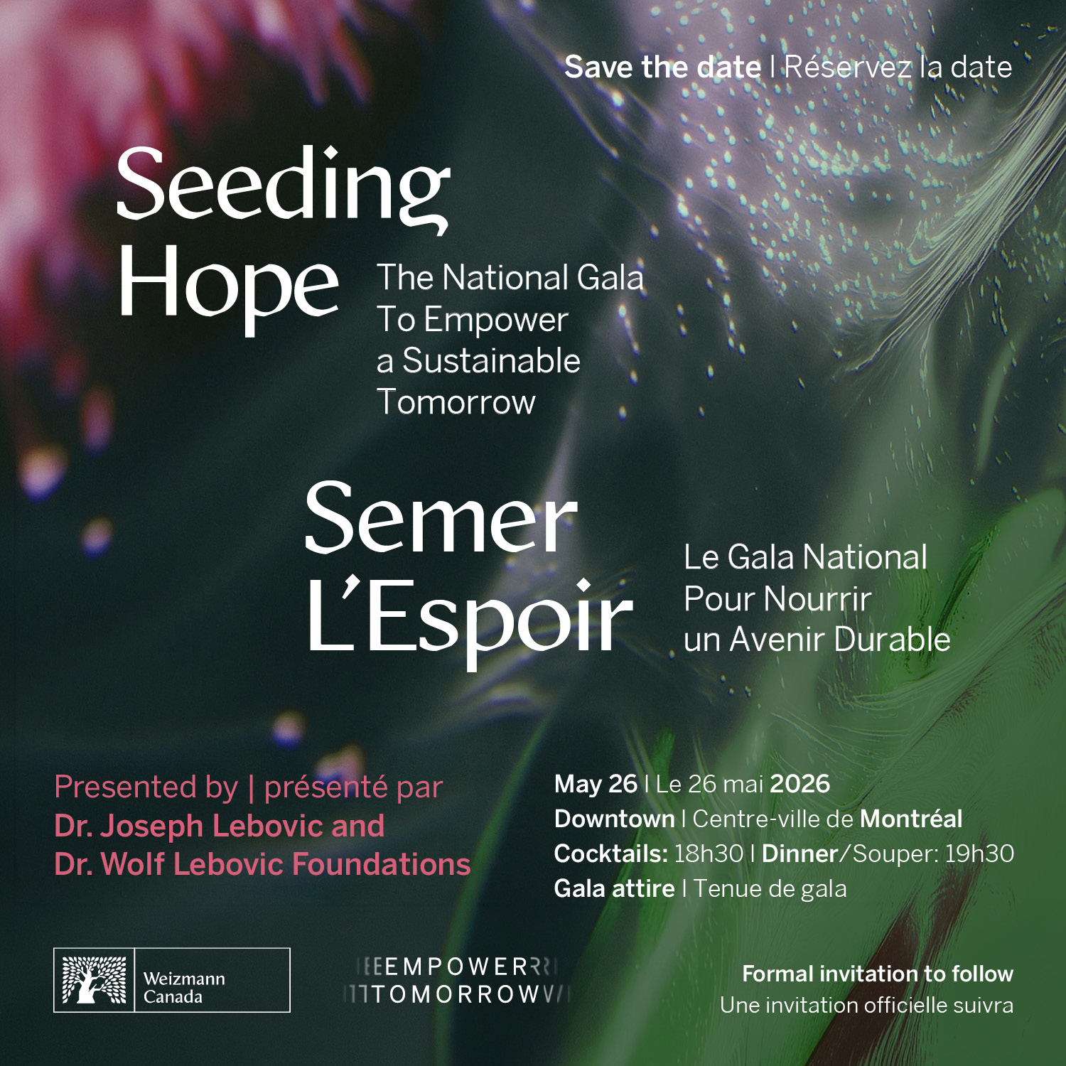
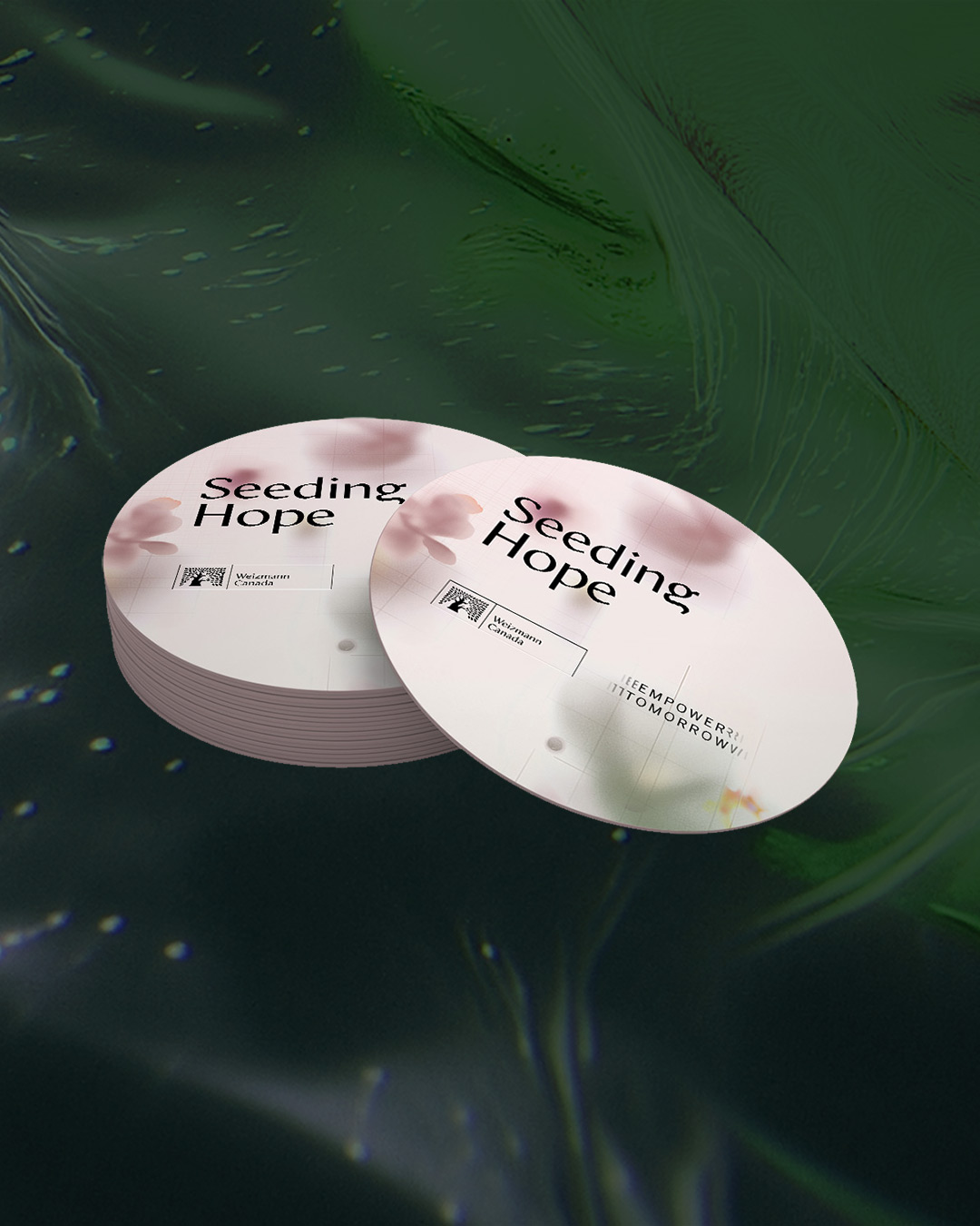
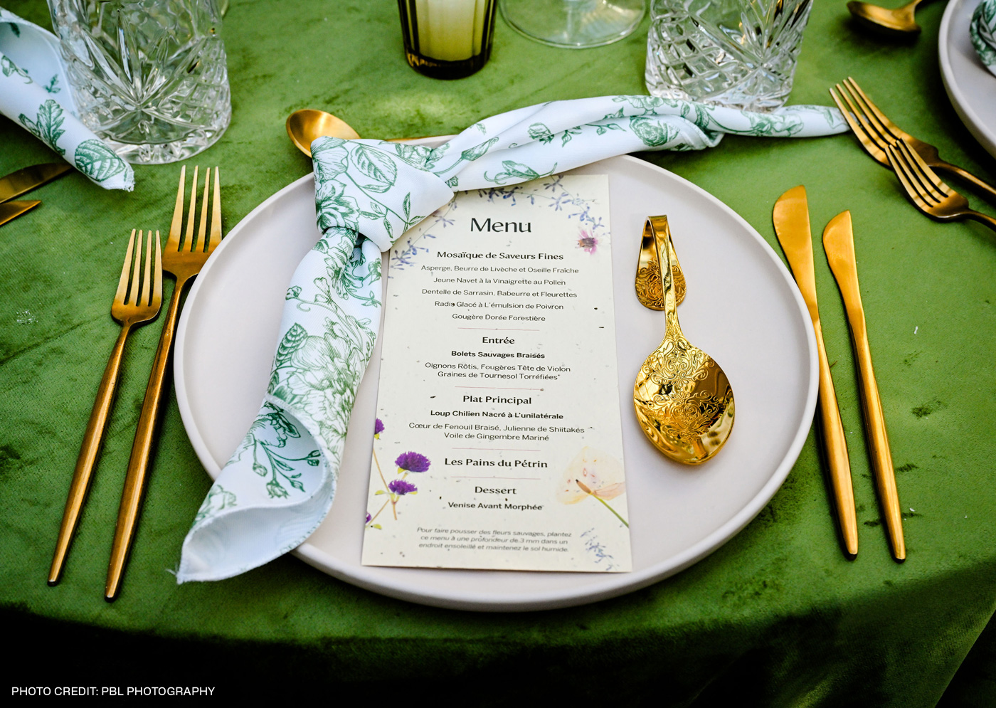
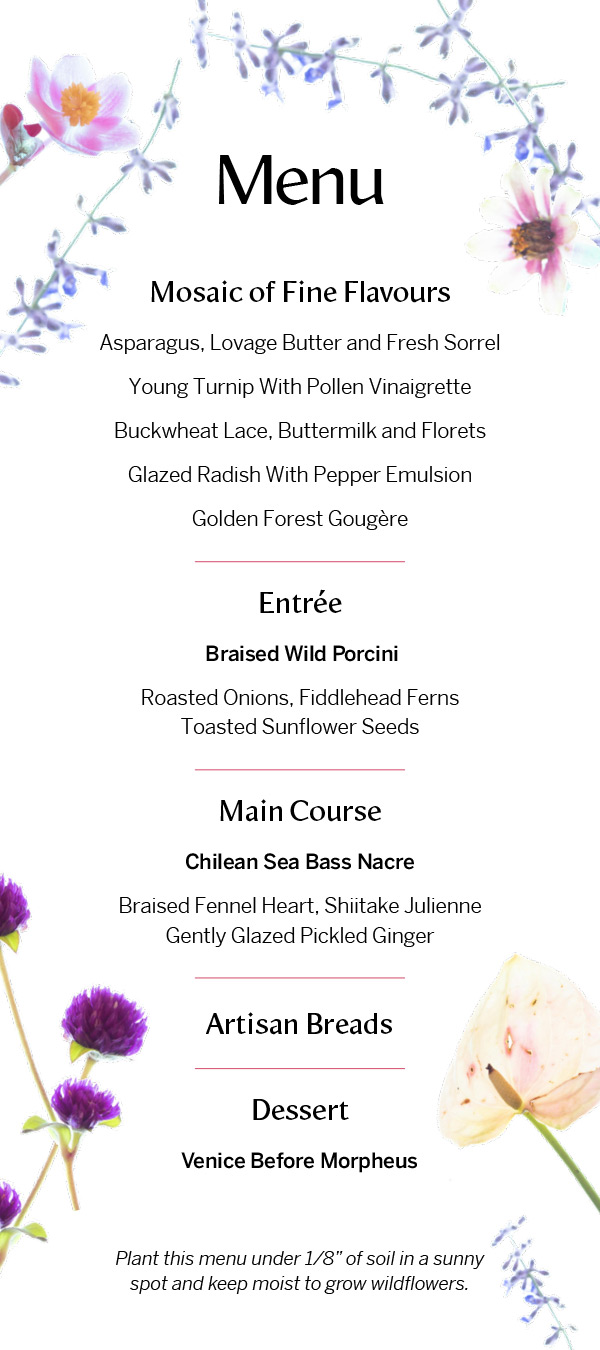
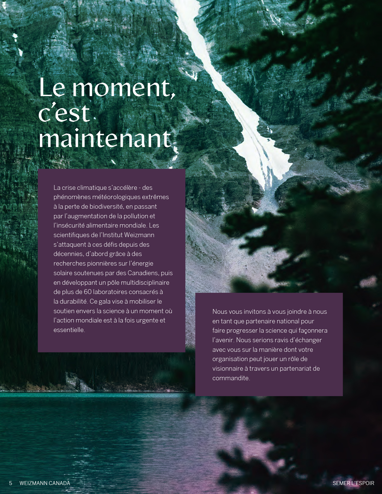
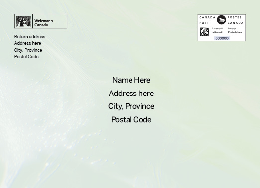
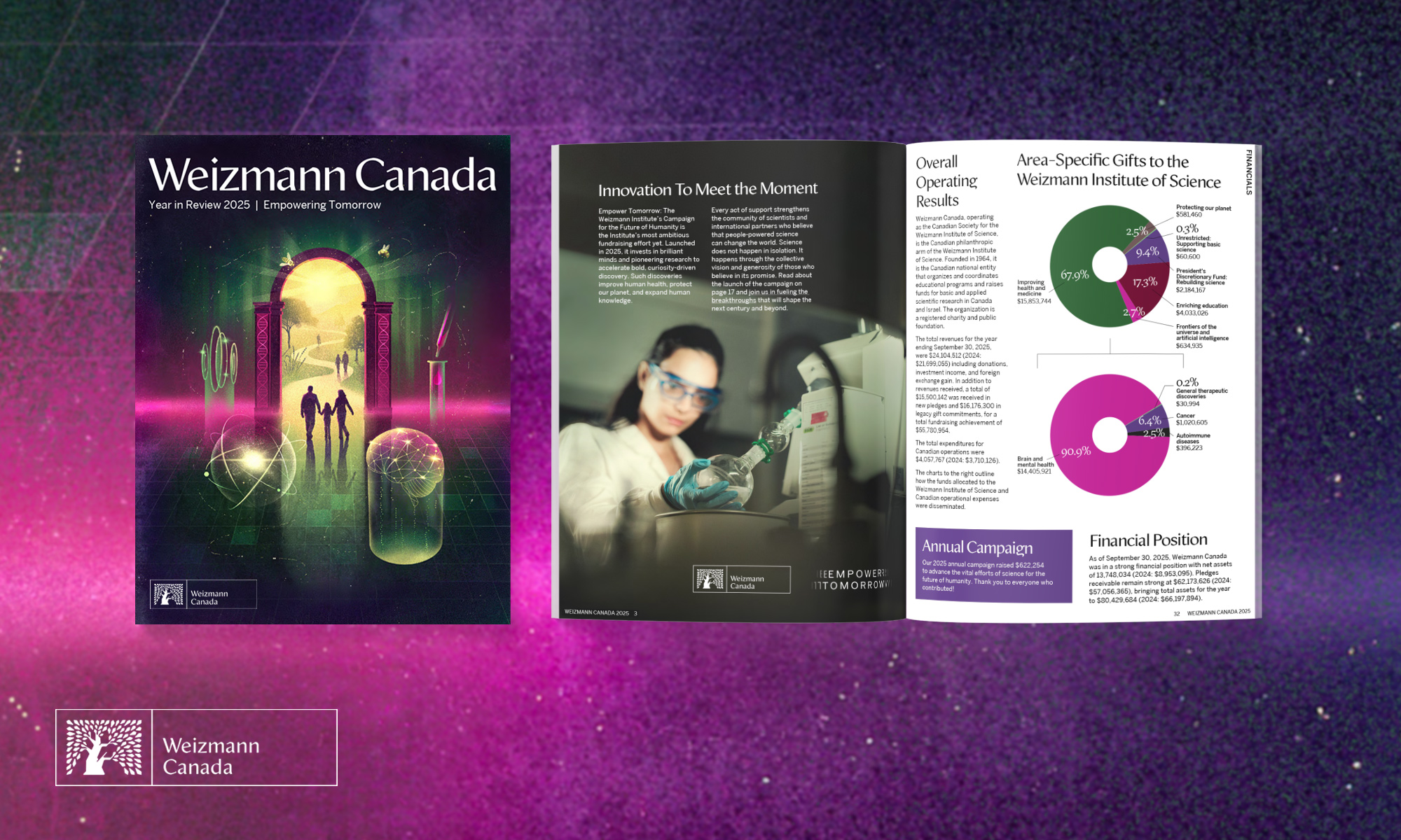
Once the visual approach was established, the branding system was applied across a wide range of print and digital materials (in both English and French), including:
- Invitations
- Save the dates
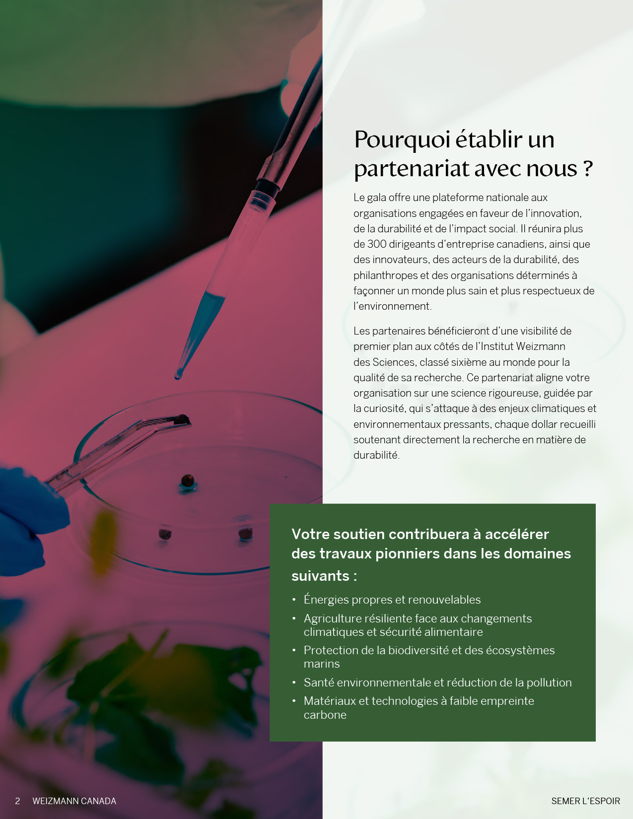
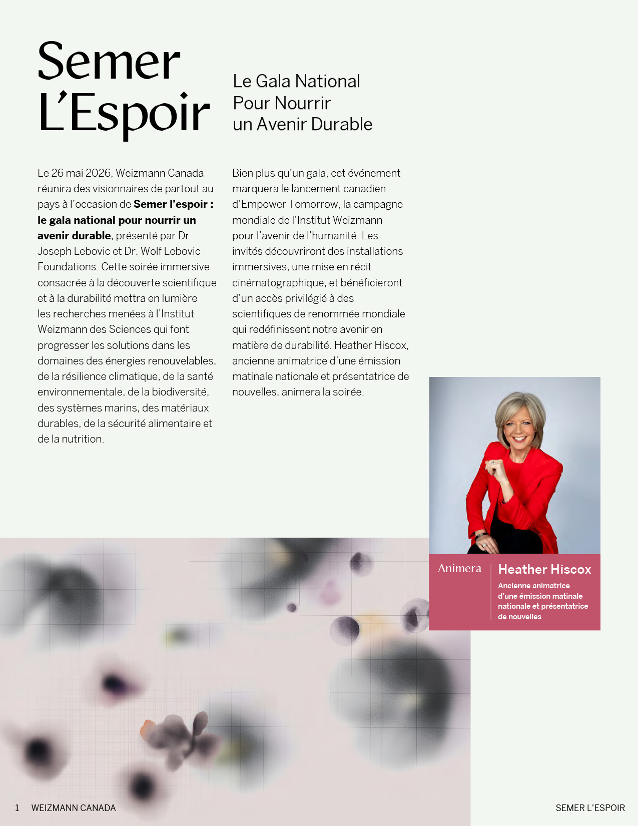
- Fundraising proposal documents
- Social media graphics
- Menus
- Coasters
- Event banners
- Environmental signage
The final result is a cohesive gala identity that feels elevated, distinctive, and adaptable across both formal print pieces and large-scale event applications.