The Science & Psychology of Colour
Complementary colours and why they are so powerful to our eye
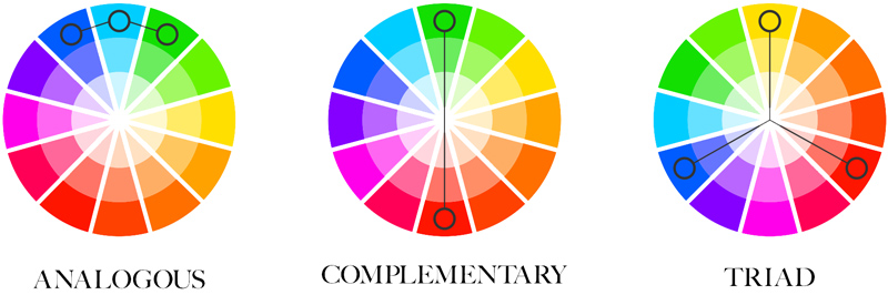
Complimentary colours are those which are opposite each other in the colour wheel, in the different ways shown below. We almost always try to incorporate complimentary colours in our brand designs. The colours are pleasing to the eye and the natural contrast they create gives high impact.
Highlights from The Scientific Reason Complementary Colours Look Good Together:
- Complementary colours are especially pleasing to the eye because different types of photoreceptor cells, which contribute to colour vision, perceive different types of light in the colour spectrum.
- Complimentary colours appear especially dynamic since they play off of one another’s intensity. Your eye wants to see that explosive pop of yellow alongside the purple wall and the complementary colours seem to sooth and balance, since they simultaneously stimulate different parts of the eye. It’s a natural example of opposites attracting.
Colours & Their Emotional Connection
A colour psychology study looked at Why Links Between Colours and Emotions Seem to Be Universal
Highlights from the study:
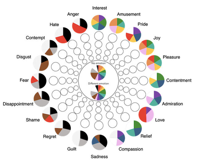
- Most colours were associated with positive emotions
- Darker colours — brown, grey, and black — were associated with negative emotions
- Red was the most controversial colour. For some, it was a very positive colour — of passion, love, and desire. For others, it was a negative colour — of danger, anger, and hate.
Colour & Gender Connotations in 2025: Does it Matter?
Where did “pink for girls and blue for boys” come from?
From How Pink And Blue Became Gender-Specific: Around the turn of the century, both sexes wore easily bleached white dresses up to age 6, meaning that gender neutral clothing was the norm. Then things slowly shifted. The baby boomers in the 1940s were the first to be dressed in the sex-specific clothing that Americans are familiar with today. Boys and girls were dressed like miniature men and women instead of uniformly in children’s dresses.
These connotations are now ingrained in our cultural consciousness so something to consider when selecting colours for your brand design.

An interesting study looks at this specifically — English colour terms carry gender and valence biases: A corpus study using word embeddings:
- Empirical studies, focused on colour preferences and colour connotations, have demonstrated that pink is considered to be a feminine colour and blue a masculine colour. Pink further represents groups of low social power and low social status. Accordingly, adult women might shun pink to avoid being associated with these representations.
- Red, on the contrary, represents being in power, dominant, and of high social status. These representations potentially explain why adult women like red and why red carries both positive and negative connotations. When it comes to valence, pink and blue both have been associated with mainly positive emotions, although blue has been also associated with sadness.
Brand Colours & Their Popularity by Industry
Is it important to use colours that are inline with your industry and what is typically expected? Generally.. probably. There are reasons certain colours are psychologically universally associated with specific brands, products, and industries.
Research on colour differentiation in the marketplace highlights how certain industries frequently use particular colours. Highlights:
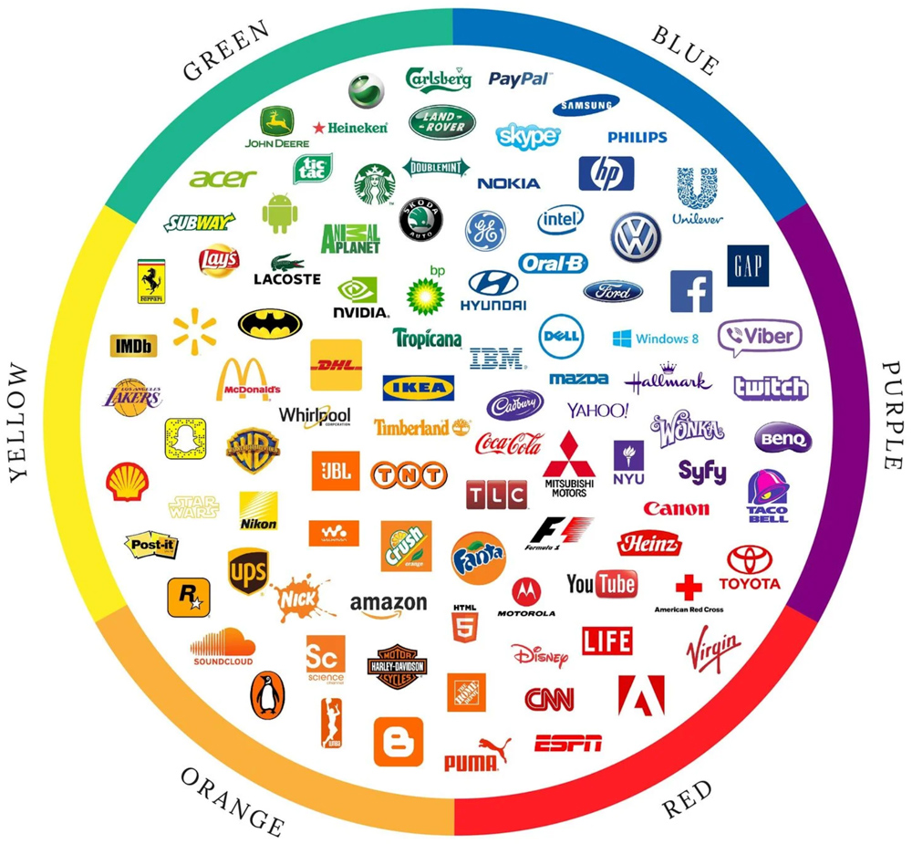
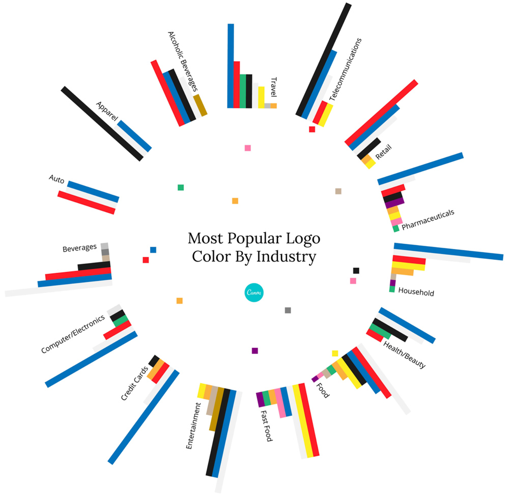
- blue is used in over 75% of credit card brand logos, and 20% of fast food brand logos.
- Red, meanwhile, is found in 0% of apparel logos — but over 60% of retail brands.
On this subject
Original by Design: Why Distinct Branding Matters
Creating a strong logo and visual identity is critical to the long-term success of any brand—whether you’re building an organization, launching an important report series, or establishing your own professional presence online.
Branding Red Flags That Instantly Make You Look Outdated
Outdated branding isn’t always obvious—but it shows. Here are the subtle design red flags that can make your brand look behind, plus a quick 5-second test to see if yours is working.
How Well-Designed Annual Reports Elevate Canadian Nonprofits and Think Tanks
Discover how magazine-style, high-visual annual reports with mini identities help Canadian nonprofits and think tanks engage audiences and showcase research.
Let’s design something great together.
If our work resonates with you, we’d love to chat about your next project.